

| Much ado about nothing? |
1) Homogenity is very important. That's why the Airtel logo change was made to happen almost overnight! Was reading recently on how they detailed the planning was. A mix of the old and new logos shows un-professionalism on the part of the branding team.
2) Colours define the logo. The Orange (and later Pink) of Hutch; Red of Vodafone, Airtel, MTS and Virgin; Green of Videocon and MTNL; Blue of Uninor, Aircel and Indicom and Yellow of Idea reinforce the use of a primary dominant colour in the logos. And red clearly steers ahead here. (similarly, the Blues of facebook and twitter and the Orange of blogger!)
3) Simplicity and meaningful wins. Contrary to expectations, the Airtel 'a' did not appeal to the youths. Neither did the common man realize the funda of a small 'a' being a symbol of humbleness. The Vodafone logo wins the deal here since people immediately connect to the blurb / quote mark. Similarly, the SIM card in the Idea logo created a stir. Uninor's random logo unit failed to make an impact.
4) Flexibility is important too. Airtel's new logo comes in two forms: Red in White / White in Red. The flexibility allows the use as suited to the background, context and desired effect. Similarly, the variation in font size for Docomo logo allows for the animation effects which are eye-catching.
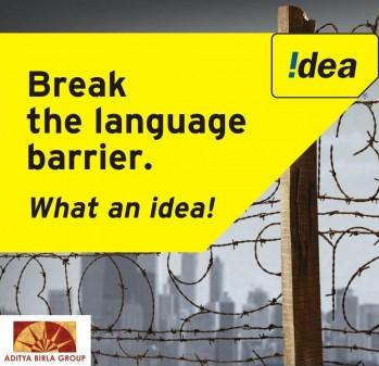
5) Overuse of concept kills. The charm wears off. Though Docomo got away with its varied logo types (kudos to the creative team for producing excellent variations), Idea used the SIM card shape idea excessively. It started with SIM shaped entry passes for their sponsored events, but the recent series of billboard ads distorting the shape of a SIM hurts in the eye. (note the yellow shape bordering the Idea logo at: http://telecomtalk.info/wp-content/uploads/2010/08/Idea-Cellular-Launches-New-Campaign-Break-the-Language-Barrier.jpg)


3 comments:
it was reading through your post that i too realised the meaning of the small 'a' of airtel. yes it is over looked most of the times. and somehow red always appeal more!
My take on the resource spending act of Branding wrt Airtel was dem needing to create Some Big noise anew..given the MNP coming n thier global venture via zain..Mayb hence the Large Spend..
Yea. It could be that. Basically new brands were entering the market and Vodafone, the largest competitor had come up with a series of exciting ad campaigns. It needed to make the noise - as you rightly said!
Seeing that it's your first time on my blog, thanks for stopping by and commenting :)
Post a Comment